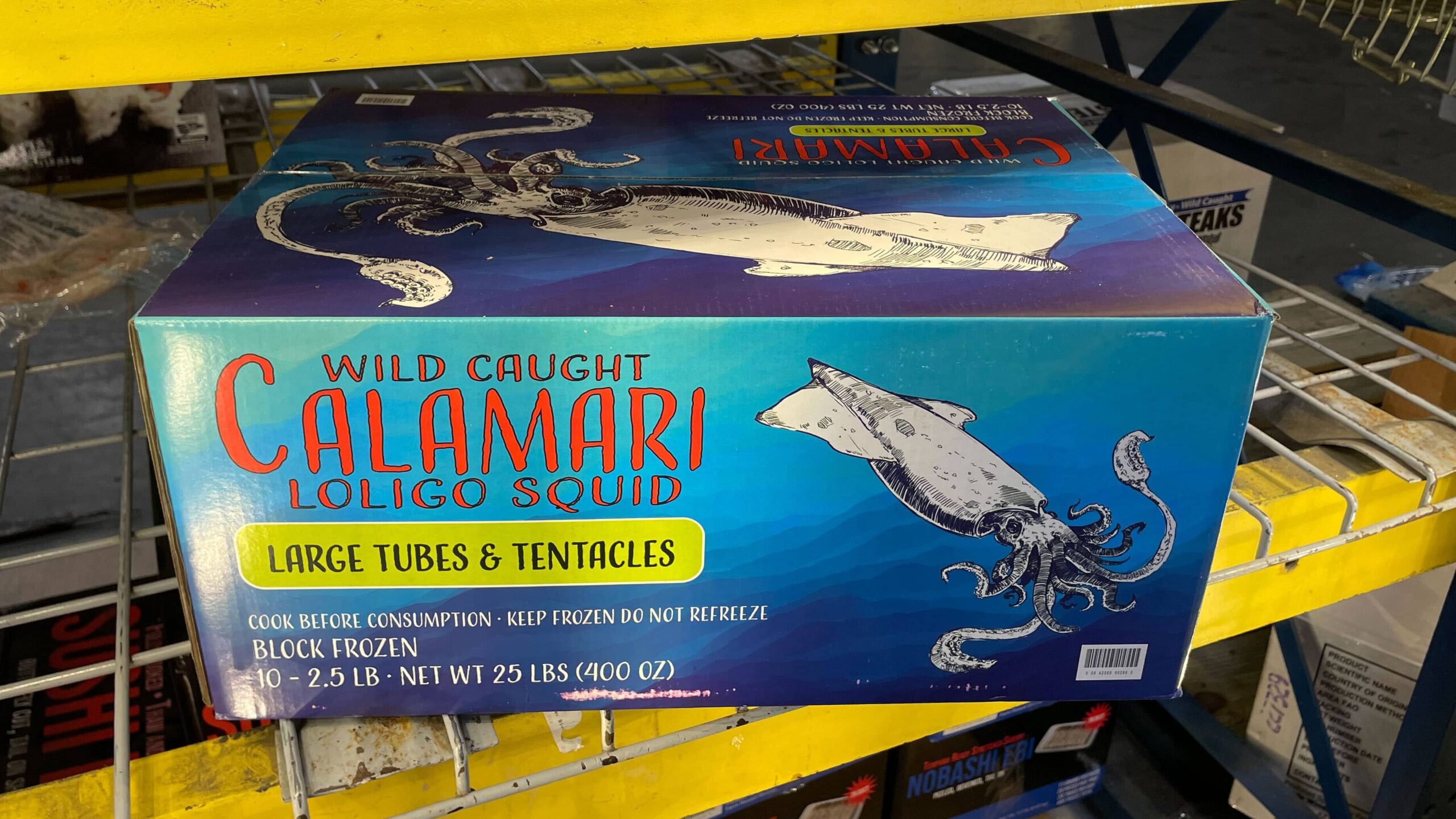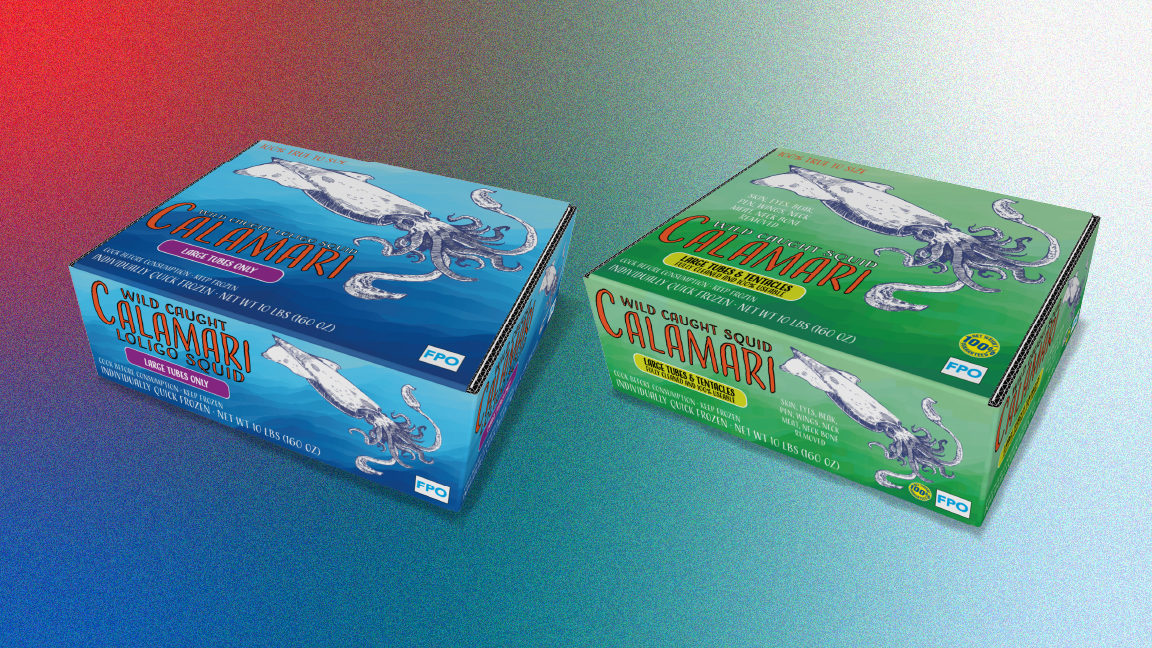
We were initially tasked with developing designs for their standard squid spec that could easily be scaled to their other line items by Jintown’s internal design team.
We began our discovery phase by visiting multiple Restaurant Depot locations and some competitors to give us some background going into our discovery workshop. We were able to work directly with VP of purchasing, Mark Hannon, during the workshop, giving us really great insight into the company, customers and product.
One of the most unique findings from our discovery phase was the request NOT to develop a brand or use one of their private label brands for this project.
Many of the items they sell are commodities, or raw ingredients. Restaurant Depot likes to lean in on the purity of their ingredients and put the product front and center in lieu of a traditional brand mark. While unconventional, this isn’t new to us, we’ve done it before.
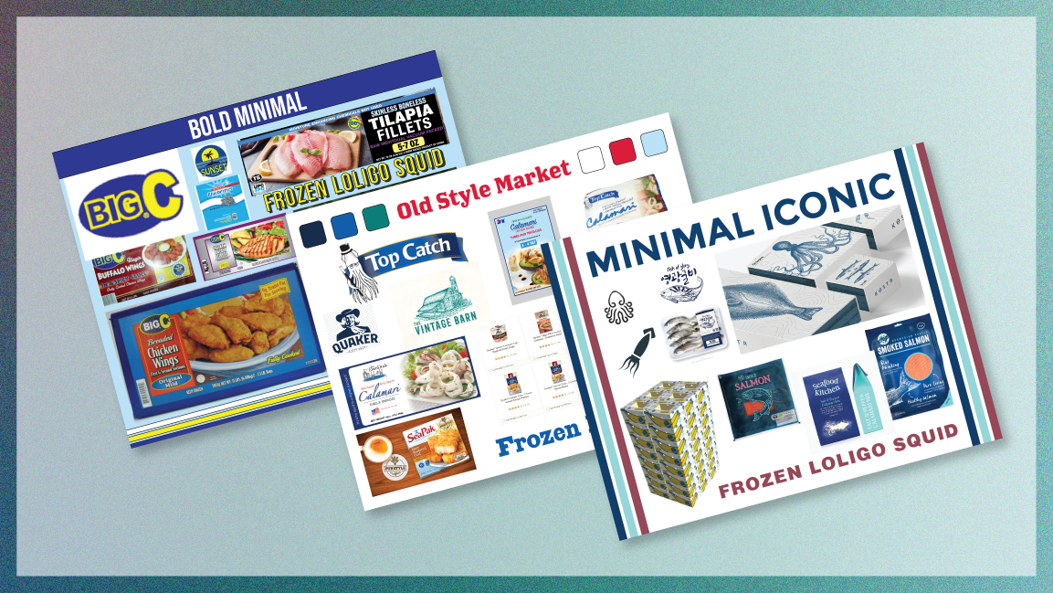
After the workshop, we presented our findings in a discovery brief which included a few stylescapes for the client’s team to choose from. Stylescapes are a carefully collected combination of images, textures, typography, and colors to communicate a certain look and feel for the brand.
We put together 3 options for the Client, each one unique but created with Restaurant Depot’s customers and brand identity in mind. We find that naming our stylescapes also helps the Client better understand why the elements on the page have been chosen and combined.
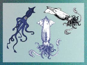
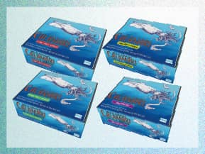
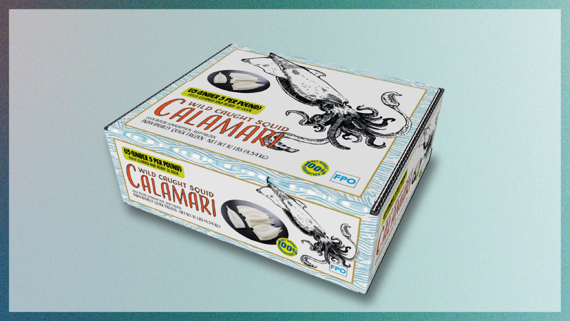
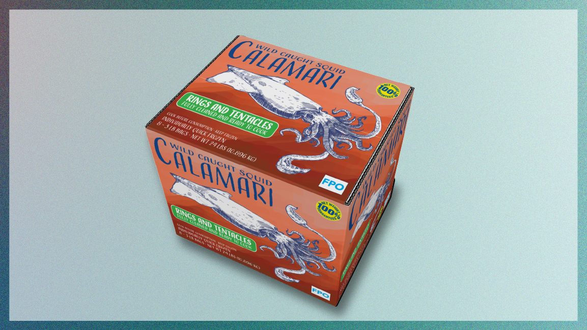
Jintown was able to go to print within weeks of closing the project and their standard squid pack hit the shelves a few months after that. Restaurant Depot has seen more consistent sales on their squid items and both companies are currently working on getting the rest of the line on the shelves in 2022.
After reflecting on the challenges Jintown’s internal design team had scaling the design, we decided to add packaging guidelines to our file delivery on all future packaging design projects. Check out an example here.
